- What I Did
- UX/UI
- Personas
- User Journey
For program leaders, the application offered a comprehensive overview of each participant’s interactions and progress. This feature enabled trainers to effectively monitor and support individual development, ensuring they had the insights needed to guide participants successfully.
The platform’s target audience included company leaders interested in training programs, independent consultants with expertise in ontology and coaching, company managers, and platform administrators. To address the diverse needs of these users, our team developed detailed user journeys for each persona. This approach ensured that our design effectively met the varying requirements of all stakeholders.
Through close collaboration and a shared vision, our team delivered an application that not only enhances the training experience but also provides valuable insights for both participants and trainers. The result is a user-centric solution that supports efficient learning and development.
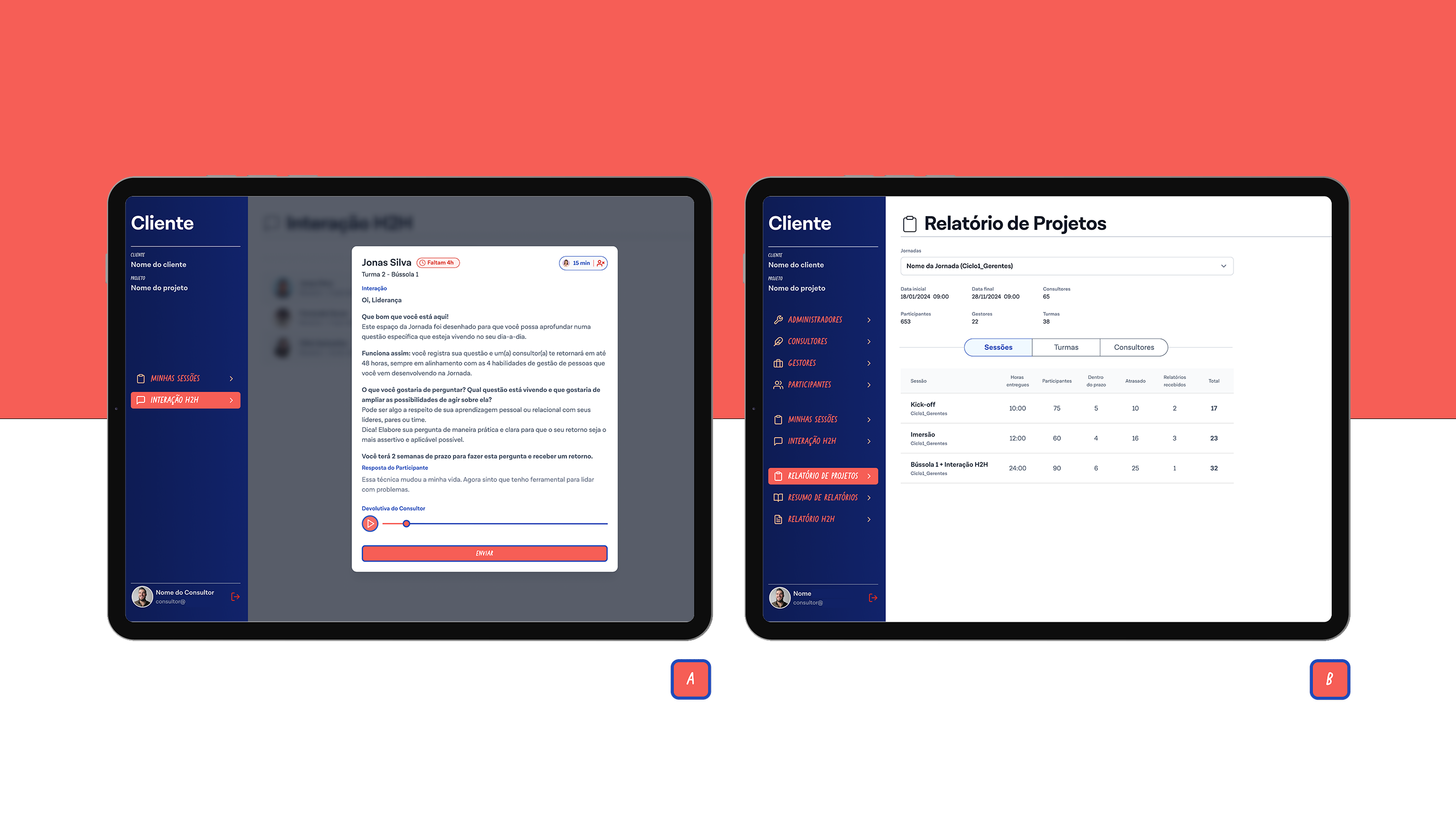
Image A is part of the consultant’s workflow. It features a countdown timer at the top showing the remaining time to respond and a second timer on the right tracking the duration of the consultant’s response. The pop-up also displays the consultant’s audio response with a built-in player for easy listening. To highlight the next step, the submit button is colored red, ensuring it stands out and guides the user clearly through the process.
Image B is part of the administrator’s workflow, which can be seen by the , specifically within the Project Report screen. This screen allows the administrator to view data for each training journey via the dropdown menu at the top. Additionally, information can be filtered using the tabs for Sessions, Classes, and Consultants, providing a clear and organized way to access relevant data.
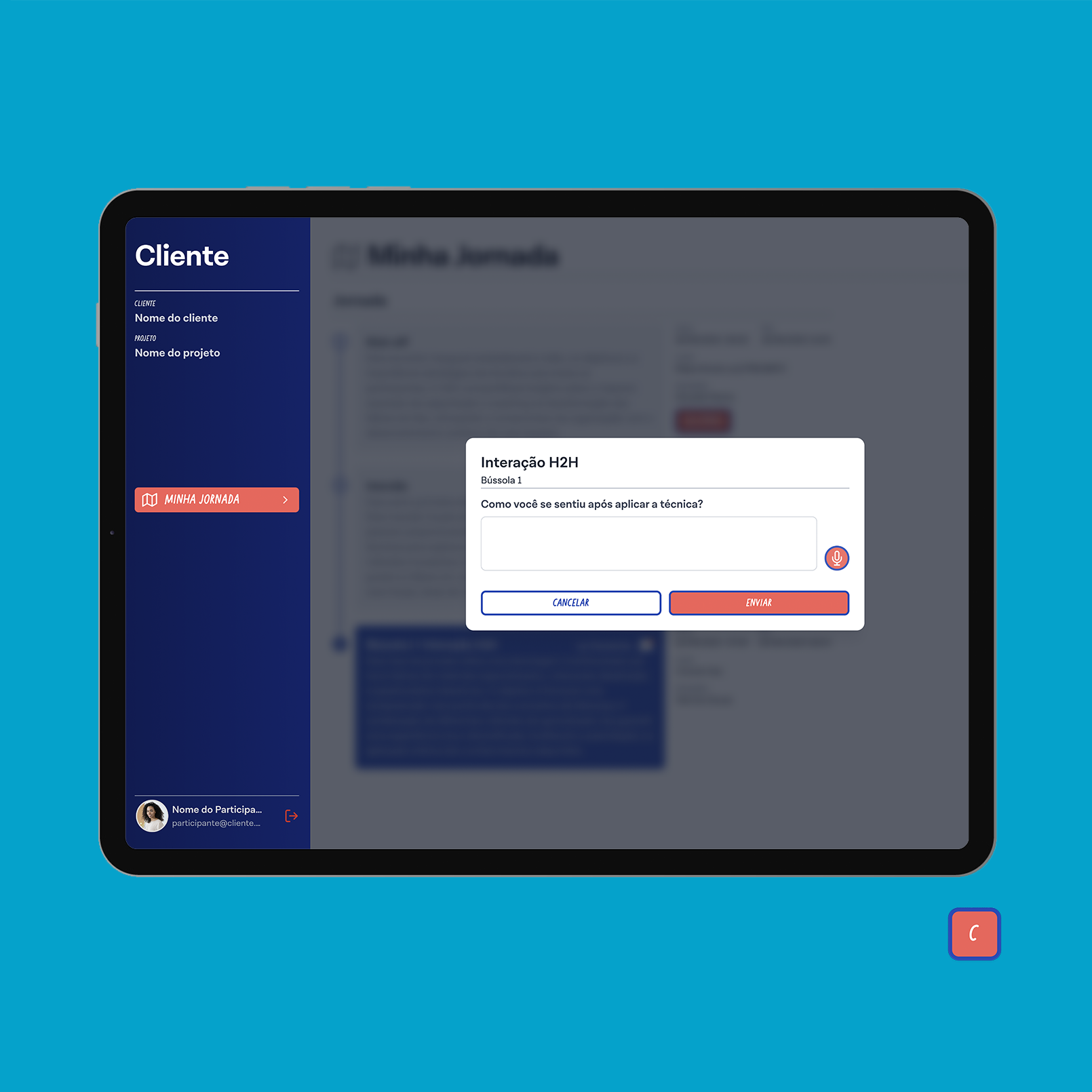
Image C is part of the user flow, where the user is responding to a Human 2 Human interaction, which will later be reviewed by a consultant. On this screen, the user can choose to respond with either text or audio, providing flexibility in communication.